This article is written by Hans Vandeveire, Digital Workplace Consultant at Devoteam G Cloud
Since I started using Google Sheets (already more than 15 years ago) I saw some brilliant solutions to experience a time-based visualization of project data, campaigns, tasks etcetera.
Most of them needed quite some effort: customized formulas to colour tiny day/week/month columns based on status fields and date fields; and in a collaborative context, those formulas would better be protected cells to prevent unwanted behaviour after an accidental change.
Recently Google created a built-in feature for this use case: welcome Timeline View!
This blog post explains why Timeline View is useful and how to create this overview step by step (you can also check this video for a step by step guide).
Why would you want to use Timeline View?
Tons of spreadsheets are used to track projects, campaigns, and tasks… Any overview of time-based or time-related subject can make use of this new functionality:
- Project management
- Marketing campaigns
- Onboarding programs
- Task management
- Cross-team collaborations
- …
As soon as a start date and end date are part of your data: a timeline visualization is indispensable.
Timelines facilitate a better understanding of the sequence of items and the duration. They also add to a high-quality user experience: insights are immediately visually available without the need to actually read and analyze dates and related topics.
How to create a Timeline View in Google Sheets?
Free Google Sheets Template
There are only two steps needed to create your first Timeline View
First step: prepare your data
An essential element is a date column (and to view a duration in your Timeline view, at least two date columns will be needed).
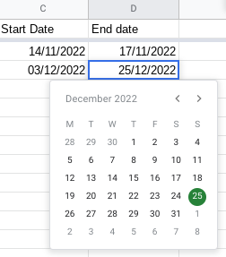
Important: make sure date columns are formatted as ‘dates’
(select the date column(s) > Format > Number > Date)
PRO TIP – You can easily add a date-picker by adding data validation to the date values; this allows users to pick a date instead of typing the date. [select the date column > Data > Data validation > Criteria = Date > Choose ‘is a valid date’]
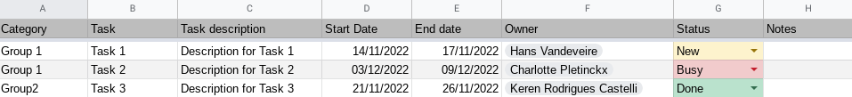
Add separate columns for other essential information like:
- Task title: a comprehensive, short title of the topic
- Task description: a more detailed description of the topic to have a better understanding
And probably other columns would be interesting as well like:
- Owner: the stakeholder responsible for the topic
PRO TIP – use the smart canvas feature to add contacts by typing ‘@’ followed by the name of the contact - Status: an indication of the topic
(like ‘pending’, ‘on hold’, ‘in progress’, … )
PRO TIP – add conditional formatting that will be used to colour the values automatically in the Timeline View
[select the column > Format > Conditional Formatting > create a rule like “Text is Exactly” > enter value “New” > choose a yellow background] - Category: any extra information that allows the grouping of data
- …
Add any column here that is useful for your business needs and consider values that you would need to group in your Timeline View.
This is an example:
Second step: create the Timeline View in your spreadsheet
As soon as your dataset is well structured and set up, you can create the Timeline View as follows:
- In your datasheet: click Insert
- Choose Timeline
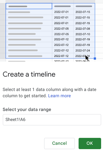
- Select your data range (or accept the automatically suggested range) and click OK
- The Timeline View is created automatically and a Settings panel is available: most settings are automatically filled in; but you are able to modify where needed
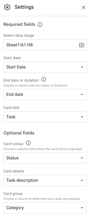
- Required fields
(if data is missing, the card will not be shown on the Timeline)
- Date range: you can adjust where needed
- Start date: choose the right column
- End date: choose the right column
- Card Title: choose the column that you would like to be shown as the title of the Timeline Card
- Optional fields
(add extra fields for more insights and a better user experience)
- Card colour
- You can choose a column from where the card colour is generated
PRO TIP – use conditional formatting for status fields! - You can manually choose a colour when clicking on a card
- You can choose a column from where the card colour is generated
- Card details: you can choose to show data from a column as a description in your Timeline View
- Card group: you can choose a column to group cards (per category, per owner, per status, …)
- Card colour
PRO TIP – you can create multiple Timeline Views in your file with different grouping settings allowing you to have different views on your data
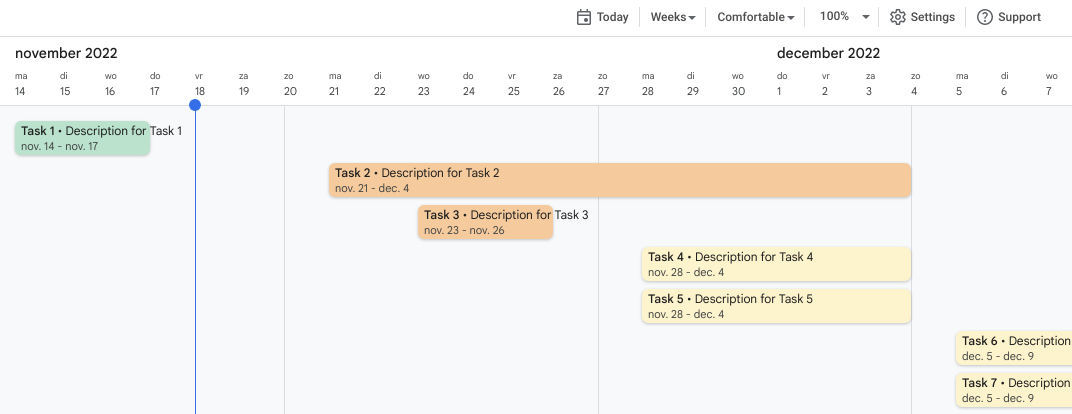
This is an example of a result:
When clicking on a card, you will see all available information:
If you need to edit data from your card, just click on the Edit Data button: you will be redirected to those specific values in your original datasheet.
How to use the Timeline View?
As soon as you have created the Timeline View and added the configuration to suit your business needs, you can start using the Timeline View:

- Click on any card to consult the details or manually adjust the background color
(Note: the color picker will be disabled when using a column with conditional formatting as a base for the card color) - Click the Today button to jump to ‘today’ on your timeline
- Click the Weeks button to switch Timeline Views
(Days, Weeks, Months, Quarters, Years, Multiyear) - Change the density of the view
(toggle between ‘Comfortable’ or ‘Condensed’) - Set an appropriate zoom to have a better view on the details
- Use the Settings button to modify your Timeline View configuration
- Click the Support button for the Google Help pages about this topic
Good to know
- Any update on the original data sheet will reflect immediately upon the Timeline View: there is no need for a refresh or a manual action.
- Using different groups (categories, status fields, owner fields, …) will allow you to have different perspectives on your project data and colours (automatically or manually) will add to a better understanding and user experience.
- The Timeline View range will automatically adjust when new rows are added to the original data sheet: just make sure that the required fields are filled in (Start Date, End Date, Card Title).
What are you waiting for?
Timeline View in Google Sheets is an extremely intuitive and useful tool to create a time-based view on any kind of time-related data: only a few clicks are needed to make this Timeline available in your sheet.
Did Google Sheets suddenly become a fully featured Project Management tool? Well, that depends on your needs, right? But I’m convinced it pretty much ticks quite some requirement boxes now…
However, I can imagine some missing features like:
- Filter options (imagine filtering on categories, status, owners, …)
- Showing dependencies between items
(like tree-structured topics or status dependencies) - A Calendar integration
(holidays, project calendar milestones events, …) - Immediate editing through the Timeline cards
- …
I’m curious to see new future developments here!
Do you have any questions regarding this topic or any other related matter? Feel free to contact us at Devoteam G Cloud!
Do you want to discuss your own project with us?

Get in touch with
Mark De Winne
Google Cloud Business Developer at Devoteam G Cloud

