Recruiting new talent, ensuring that applicants are followed up, analysing the conversion rate per channel… These tasks are well-known to recruitment managers who must know, at any given time:
- The number of employees they have recruited this week
- Which business unit is behind its targets
They must also monitor the evolution of these metrics over time. Without analytical tools, this is a challenge. It’s even more challenging when this task is split across different countries and entities.
How can you avoid asking every business unit manager to share their results every month? How can you detect problems before they come up? Here’s how: by getting efficient data from a simple and free data visualisation tool. Which one exactly?
In this article, you’ll learn about the solution and the benefit it brings to the recruitment sector.
Article written by Devoteam G Cloud’s Valentin Coudert, Pre-Sales Engineer, and Hugues Zimmermann, Full Stack Cloud Developer
Retrieving data at the source
Come forward SmartRecruiters. Recruiters and managers use this tool to find future employees, follow up interviews and make contracts.
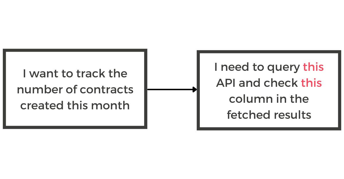
The raw data is stored in the SmartRecruiters database, which can then be used to track management metrics. To retrieve it programmatically, you can use APIs. CSV exports are also possible.
At this stage, what’s important is working on the data model: that is to say, translating the business need from the recruiter’s point of view into its technical equivalent, so that developers know what to do.
Both the recruiter and the developer need to work together as the document will serve as a reference for future discussions.
Let’s see how the data gets stored to maximise performance.
Data storage
Some data visualisation systems could connect directly with your ATS (Applicant Tracking System), but performance is likely to be insufficient: API calls are too long, especially to retrieve sufficient history to make statistics.
For this reason, the data is stored in a data warehouse, which is designed to receive a high volume of data and provide the indicators wanted by recruiters.
With Google Cloud, you can use Google BigQuery, a highly efficient, low-cost, and scalable tool that has native connectors with the majority of data visualisation tools.
At Devoteam, there are about 500.000 rows of data recorded in BigQuery, one year after the existence of our reports. This large amount of data hasn’t impacted the performance of queries or the display of charts at all.
Data visualisation, or how to bring numbers to life
You have probably heard the saying : “A picture is worth a thousand words”. It is also true for data visualisation.
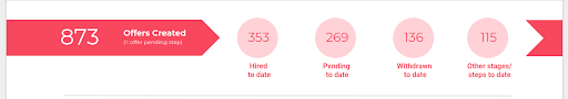
In table format, tracking the evolution of a metric is too hard: there is too much information and not enough focus on what is important. In histogram format, it gets a lot easier to read.
That’s where Data Studio comes in. It is a free tool included in Google Workspace. In just a few clicks, you can connect it to BigQuery, your data source, and create any chart you want.
With a touch of design and good sense of organisation, you can easily come up with a dashboard that will make anybody want to consult it. Moreover, the data is updated every hour, which is ideal for monitoring indicators in real time.
Finally, Data Studio has some practical features such as the ability to use filters, export data to CSV or Google Sheets, and even schedule the sending of a PDF report.
Here’s an example of filters based on date.

How should you manage reports if your organisation has entities in several countries though?
Restrictions per business unit: the icing on the organigram
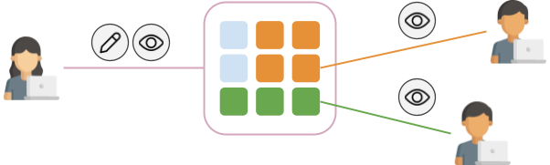
Devoteam has a recruitment team at Group level, but also local ones for each entity. If your company has a similar configuration, here’s how you can kill two birds with one stone using your report:
- Local entities can’t change charts or metrics (read only mode)
- They only see data from their entity
It saves a lot of time in communicating figures and sharing information. It also makes everyone feel more involved and invested. Finally, a common report provides a common language for all recruiters in the Group, and thus facilitates sharing experiences.
In a nutshell, with SaaS recruitment solutions, the data is just waiting for your green light to reveal its secrets. The success of such an activity relies heavily on data storage performances and the ability to create reports.
For the former, BigQuery is a solution, while the latter can be done through Data Studio.
If you would like to find out more about how Google Workspace and Google Cloud can help you in your recruitment process, consider contacting us. Our experts will help you find the best solution for your organisation.

